Dusk on the Delaware: The FringeArts Atmosphere
The first frame belonged to the bridge
The late autumn sun dropped below the Benjamin Franklin Bridge circa the 4:42 PM to 4:58 PM window, and the room began to behave like a drawing. Long, geometric shadows cut across the polished concrete floors of FringeArts. Steel, glass, and exposed brick took on that brief waterfront severity Philadelphia gives you just before evening.
The couple wanted industrial loft wedding photography at FringeArts that did not soften the building into something polite. Good. The space had its own pulse: footsteps echoing against brick, a chill in the vicinity of 48 degrees pressing in from the Delaware River, amber fixtures warming the edges of the room like low candlelight.
This was not a large wedding pretending to be small. It was a deeply intimate, forty-guest celebration inside a converted industrial loft, and the rawness mattered. The exposed materials were not backdrop in the decorative sense. They were part of the emotional architecture.
That distinction shaped the first decision of the day: track the sun, place the couple where the bridge shadows became structural lines, and let the city draw around them.
Main Point: The venue did not need disguise. It needed disciplined framing, controlled light, and the confidence to let rough surfaces remain rough.
Case Study Takeaways: Intimacy in Industrial Spaces
The photographic plan in practical terms
The central problem was simple to name and difficult to solve: forty guests inside an on the order of 10,000-square-foot industrial footprint. A room at that scale can make a micro-wedding look under-attended even when it feels emotionally full.
The strategy came from mapping the floor plan before thinking about decoration. The outer perimeter became intentional negative space. The central dining zone carried the visual weight. That meant the camera could read the celebration as intimate rather than sparse.
- Guest count: Forty attendees, arranged to preserve closeness rather than scatter energy across the room.
- Spatial anchor: A single 32-foot king’s table created one strong line through the reception.
- Lighting approach: Directional sources shaped faces and hands while leaving the far edges in shadow.
- Lens strategy: Longer focal lengths compressed the venue’s industrial framework around the couple.
- Editorial mood: High contrast, amber warmth, deep blacks, and no apology for darkness.
At Faith West Photography, the service provider role in a room like this is not to fill every void. It is to decide which voids are doing useful work.
Expert Tip: In a cavernous venue, negative space should be assigned a job. If it does not frame, isolate, or intensify the subject, it usually becomes visual drift.
The Challenge: Scaling Cavernous Architecture
When height becomes a compositional problem
FringeArts asks a hard question of wedding photography after sunset: how do you keep the romance moody without letting the couple disappear into the building?
The architectural hurdles were specific. The ceiling clearance reached 35 feet. The floor plan opened broadly. Natural light faded fast after the river portraits. By reception time, the industrial framework held large pockets of shadow, and those shadows could either become atmosphere or swallow the subjects.
There was an early temptation to solve the scale with infrastructure. A massive overhead truss system would have visually lowered the ceiling and made the lighting more uniform. It also would have fought the building’s character and made the reception feel staged inside a temporary production rig. That was the one idea worth rejecting quickly.
The more subtle problem sat at table height. Forty guests around one 32-foot king’s table can look beautifully communal in person, but the camera sees gaps differently. Empty floor around the table reads as absence unless the frame gives it intention.
Brightening the entire room would not have fixed that. Broad light on polished concrete often turns atmosphere into glare, especially when the ceiling is too high to give a useful bounce. Attempting to bounce flash off 35-foot black ceilings is the kind of move that produces flat, muddy exposures and very little romance.
So the challenge was not illumination alone. It was scale, shadow density, reflectivity, and emotional legibility all at once.
Caution: A raw industrial venue can look abandoned in photographs if the lighting plan treats empty space as a defect instead of a compositional boundary.
The Solution: Directional Light and Spatial Framing
Carving the couple out of darkness
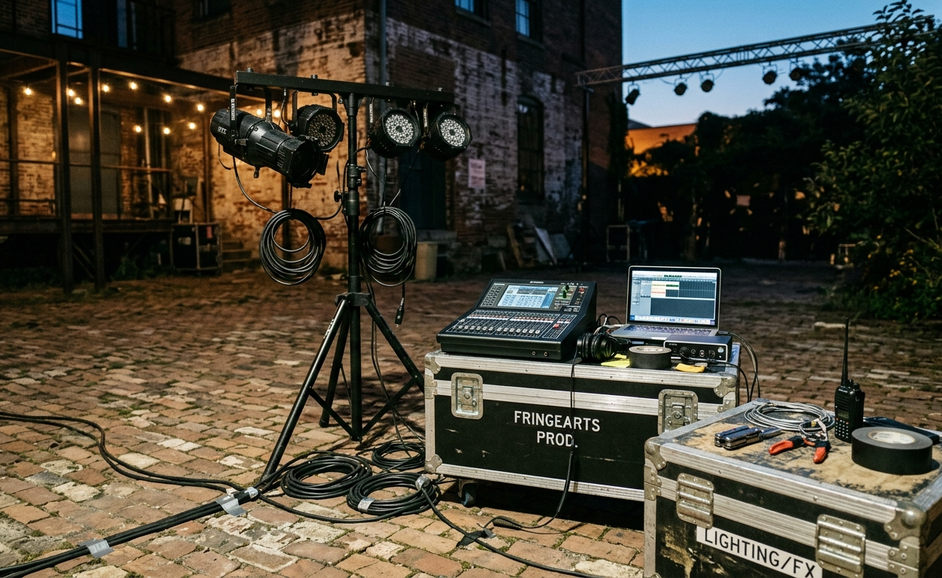
In practical scenarios, the solution began with restraint. Rather than washing the room, the lighting team used a four-point off-camera flash setup with tight grid modifiers. Those grids restricted spill to a 15-degree radius, thereabouts, which kept light on faces, shoulders, florals, glassware, and hands while allowing the room’s corners to fall away.
That choice gave the photographs a clear hierarchy. The couple came first. The table came second. The architecture held the outer frame.
Faith West Photography frequently documents expansive 300-guest galas across Philadelphia, including formal rooms where broad, balanced illumination serves the event well. This forty-guest FringeArts configuration required the opposite: highly localized micro-lighting instead of a room-wide glow. A ballroom habit, even one that suits Ballroom at the Ben, would have flattened this venue’s strongest traits.
The lensing mattered just as much. The lead photographer worked primarily with 85mm and 135mm focal lengths for portraits and reception moments where compression could pull the exposed steel beams closer to the subjects. That compression reduced dead space and made the industrial structure feel intimate rather than distant.
One catch: telephoto compression indoors required at least 40 feet of unobstructed backing distance for the photographer, which severely limited mobility during seated dinner service. That constraint shaped the shooting lanes before guests entered the room.
- Map the venue floor plan and mark intentional negative space.
- Place the king’s table where the room’s strongest architectural lines converge.
- Fit off-camera flashes with grid modifiers to avoid broad room washes.
- Vary the grid modifier angle based on the reflectivity of the concrete floor finish.
- Reserve long, unobstructed lanes for 85mm and 135mm compression.
- Protect candlelight and amber practicals from being overpowered by flash.
The technical goal was not brightness. It was separation.
Capturing the Alternative Aesthetic
High contrast as an emotional choice
The alternative aesthetic here was not a costume. It was a rejection of the bright-and-airy wedding reflex: no pastel haze, no softened brick, no attempt to make the warehouse behave like a garden conservatory.
The photographs leaned into high contrast, deep shadows, and raw emotion. Portraits held the couple against gritty textures instead of floating them away from the venue. Candids kept the amber practical light intact, so skin, glass, and concrete shared the same evening temperature.
Posing stayed editorial but not rigid. The couple walked slowly along the Delaware River during the 15-minute structural portrait window, then moved inside where the camera favored smaller gestures: fingers touching at the edge of the table, a laugh half-hidden by candlelight, shoulders turning toward each other while the room fell into darkness behind them.
The editing philosophy followed the same logic. Color temperature stayed locked at 3200K to preserve the native tungsten wash. Neutralizing that amber cast would have made the files cleaner in a technical sense, but less faithful to the night. The warmth was part of the memory.
Main Point: For this event, accuracy did not mean making every surface neutral. Accuracy meant preserving the way the space actually felt after sunset.
Results: A Cinematic and Cohesive Gallery
The final album’s visual rhythm
The finished gallery worked because the shadows were allowed to stay active. They did not merely surround the guests. They tightened the perceived scale of the forty-person celebration and made the reception feel enclosed, almost secretive, inside a much larger shell.
The album sequence mattered. It opened with stark, structural portraits along the Delaware River, where the bridge and the waterfront gave the couple a graphic outline. Then it moved inward. The reception images became warmer, closer, and more tactile: candlelit faces, amber reflections, black steel overhead, concrete underfoot.
That shift created a cinematic rhythm. Exterior frames established the city and the industrial mass. Interior frames narrowed the emotional field until the wedding felt gathered around one table, one room, one evening.
The raw architecture served as a framing device rather than a distraction. The high ceilings gave darkness somewhere to rise. The exposed brick gave the portraits grain and resistance. The polished concrete returned just enough reflection to keep the room alive without making it glossy.
Would the gallery have looked cleaner with more light? Perhaps. It would also have looked less like FringeArts.
Embracing the Shadows: A Final Recommendation
Do not turn an industrial loft into a daylight set
When hosting an intimate wedding in a raw industrial space, do not try to flood the room with artificial daylight. That instinct usually comes from fear: fear that the room will look too dark, too large, too unfinished. But the shadows are often the venue’s most honest material.
Use localized, dramatic lighting. Let the perimeter fall away. Give the table warmth, give the couple shape, and let the architecture hold its weight in the background.
For FringeArts, and for industrial loft weddings like it, the strongest choice is clear: lean into the darkness and build a cinematic gallery that honors the room instead of correcting it.