Foundational Aesthetics in Heirloom Documentation
A wedding's visual narrative begins long before the first guest arrives at a venue like the Ballroom at the Ben. The invitation suite serves as the initial tactile experience of the celebration, setting the tone and aesthetic expectations for the entire event. When couples overlook how stationery materials interact with light, the resulting detail photographs often fall flat. These uninspiring images fail to document the foundational aesthetic of the wedding day, losing the delicate nuances that make the design unique.
The most photogenic invitation suites rely on three core elements—heavyweight textured paper, deep impression printing techniques, and cohesive styling accessories. Capturing these intricate details requires precise technical execution from the lead photographer. Professionals typically employ a 100mm macro lens for this specific task. They stop the aperture down to f/4.5 or f/5.6 to maintain edge-to-edge sharpness across the entire paper suite. This specific depth of field ensures that every fibrous edge and ink impression remains crisp. It balances light absorption and contrast to create a truly dimensional image that honors the couple's investment in their paper goods.
Supported by the 45 to 60 minutes dedicated exclusively to styling and photographing the paper goods on a typical wedding morning, this approach to material selection helps preserve the physical artifacts of the celebration with artistic integrity.
Structural Integrity and Micro-Shadow Generation
Consider the process of categorizing paper stocks by their micro-shadow generation under directional window light. Stacking a suite completely flat on a styling mat often causes the layers to visually merge into a single, dimension-less block. Elevating the main invitation card using 1/4-inch clear acrylic styling blocks creates distinct drop shadows that separate the pieces. This elevation technique demands structural integrity from the paper itself.
A 220lb double-thick cotton rag holds its shape perfectly when suspended on risers. Thinner stocks might bow or curl under their own weight, ruining the illusion of floating layers and creating distorted reflections. The surface texture of the chosen paper dictates its light absorption qualities. Matte, fibrous papers absorb directional light and generate soft micro-shadows that emphasize the material's tactile quality. Glossy or coated papers create harsh, distracting glare in the camera lens. This glare strips the image of its romantic softness and obscures the printed design.
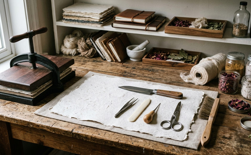
Handmade papers with deckled edges or translucent vellum overlays offer additional textural contrast. They catch the light in unpredictable, organic ways that add visual interest to the composition. A photography studio dedicated to heirloom documentation understands that these subtle material choices profoundly impact the final gallery.
Dimensional Typography and Impression Depth
Examining a physical impression depth on the order of 0.5mm in cotton paper reveals the photographic advantage of traditional printing methods. Letterpress and blind debossing create physical valleys in the paper that macro lenses can capture beautifully. These techniques add a three-dimensional quality to the typography. Digital flat printing simply cannot replicate this depth, as the ink sits entirely on the surface of the paper, offering no physical relief for the light to catch.
To photograph these deep impressions effectively, the photographer positions a white foam reflector opposite the window. This tool bounces soft light back into the deep impressions of the letterpress. It prevents the shadows from becoming too heavy and obscuring the typography, ensuring every letter remains legible and elegant. Foil stamping introduces a different set of variables to the styling process. While these lighting techniques reliably enhance texture, highly reflective metallic foils will bounce light directly back into the lens, obscuring legibility entirely when photographed under direct overhead sunlight. Photographers must angle the lens carefully to capture the foil's brilliance while maintaining the readability of the text.
Cohesive Color Theory and Compositional Balance
Building a cohesive color story requires selecting tones that translate accurately through the camera sensor. Drawing on an analysis of Faith West Photography styling records, excluding highly saturated neon inks from flat lay styling prevents unavoidable color casting on adjacent cotton rag. Soft, organic palettes maintain the elegant, romantic tone of the imagery, allowing the natural textures of the materials to take precedence over aggressive color profiles.
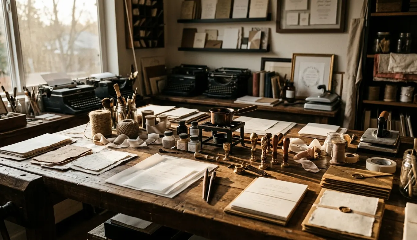
Integrating styling accessories provides necessary scale, texture variation, and compositional balance to the photograph. A 1.5-inch wide hand-torn silk ribbon introduces a fluid, delicate element against the rigid paper edges. Arranging unattached vintage postage stamps in a slight arc counterbalances the visual weight of a heavy custom wax seal placed on the opposite corner of the envelope. These elements, created with 1-inch brass wax seal stamps, guide the viewer's eye across the flat lay in a deliberate, pleasing manner.
Essential Elements for Stationery Documentation
- Two complete invitation suites (allows simultaneous photographing of front and back designs)
- All corresponding envelopes, including inner and outer layers
- Unattached vintage postage stamps
- Pre-made custom wax seals
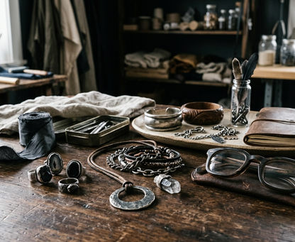
Organic floral elements add a final layer of life and context. They tie the stationery suite to the broader floral design of the wedding day, creating a cohesive visual narrative that flows seamlessly from the morning details to the evening reception.
Morning Light and the Tactile Vignette
The execution of these principles unfolds in the quiet hours before the celebration begins. Evaluating the ambient light in the bridal suite determines the optimal angle for the styling mat. This evaluation ensures the directional light rakes across the paper to highlight its texture. Systematically turning off all artificial tungsten lamps in the hotel room before beginning the flat lay ensures the north-facing window light remains uncontaminated by warm, orange color casts.
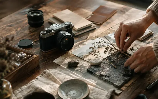
A photographer works quietly by a north-facing window in a historic Philadelphia hotel room on the morning of the wedding. They arrange the handmade cotton invitations on a linen styling mat, adjusting a silk ribbon to catch the natural light, and lock focus on the letterpress typography. The final result is a timeless, tactile image that preserves the couple's design intent long after the paper itself has been mailed and stored.